Expand Real Self-Help
Give customers a real path to resolve common issues without calling the support center.

Chase · Customer Support
UX Design Lead at JPMorgan Chase, redesigning a customer-support experience within a platform serving 50M+ monthly users. I replaced a shallow carousel with a structured, device-aware self-service system that went on to average 40,000+ monthly Help Tips views.
Chase’s customer service page offered almost no real self-help.
Its one video resource lived inside a shallow carousel with little detail, doing little to reduce calls to the main support center.
At platform scale, that thin experience left customers without a clear path to solve common banking problems on their own.
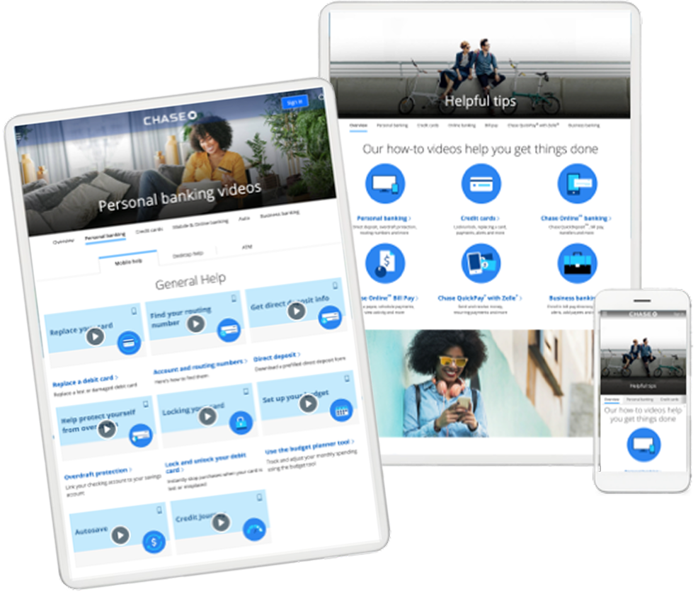
I broke the video catalog out into its own experience, organized into 7 tabbed categories, each housing a curated set of videos addressing common problems like replacing a lost card or finding a routing number.
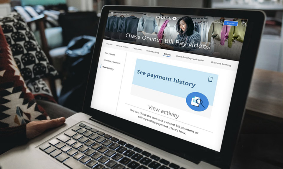
Users could toggle guidance by device — mobile, desktop, or ATM — and each video linked out to a dedicated page with a full step-by-step written walkthrough alongside a larger video view. The system is still live and functional today.
Give customers a real path to resolve common issues without calling the support center.
Replace a shallow carousel with a tabbed gallery customers could browse with intent.
Let users toggle guidance for mobile, desktop, or ATM based on where they were starting.
Link each topic to a dedicated walkthrough page with written steps and a larger video view.
Chapter 01
I explored structure options for a clearer self-help catalog.
I started testing how categories, topics, and entry points could replace the thin carousel model.
There were two major sections. I reviewed the existing customer service and self-help surfaces to see how little real guidance customers actually had.
The support experience leaned on a shallow carousel with limited detail—making it hard to solve common banking tasks without calling in.
Chapter 02
To start, I mapped and categorized how customers needed to move through the system.
It was key to build a system to support customer intent into the right video and written walkthrough—so the experience could deflect common questions at platform scale.
From there, I explored different page structures to create a clearer self-service catalog, bringing the two primary pages together.
The goal was to improve discoverability and make the most sought-after tasks easier to find and access.
As we moved forward, it became clear that each category needed its own dedicated page, with a flexible structure for organizing multiple tasks and features.
The pattern was designed to adapt across desktop and mobile while keeping the experience contained within a single page.
Each detail page was going to need a handful of conditions.
Allow for quick toggle between each item in the category. Step by step instruction. Video display.
Chapter 03
As we locked in the categories, we started to break that topic into separate sections.
We also spent great time pairing proper imagery that needed to work across multiple breakpoints.
There were two major sections. I reviewed the existing customer service and self-help surfaces to see how little real guidance customers actually had.
The support experience leaned on a shallow carousel with limited detail—making it hard to solve common banking tasks without calling in.
Individual pages for each topic paired a full written walkthrough with an enlarged video view, built on a custom thumbnail and spot-illustration system within Chase’s pattern library constraints.
I owned every layer of the experience and had to solve it using only what already existed in Chase’s public design system — similar to a Workday-style platform where new components weren’t an option.
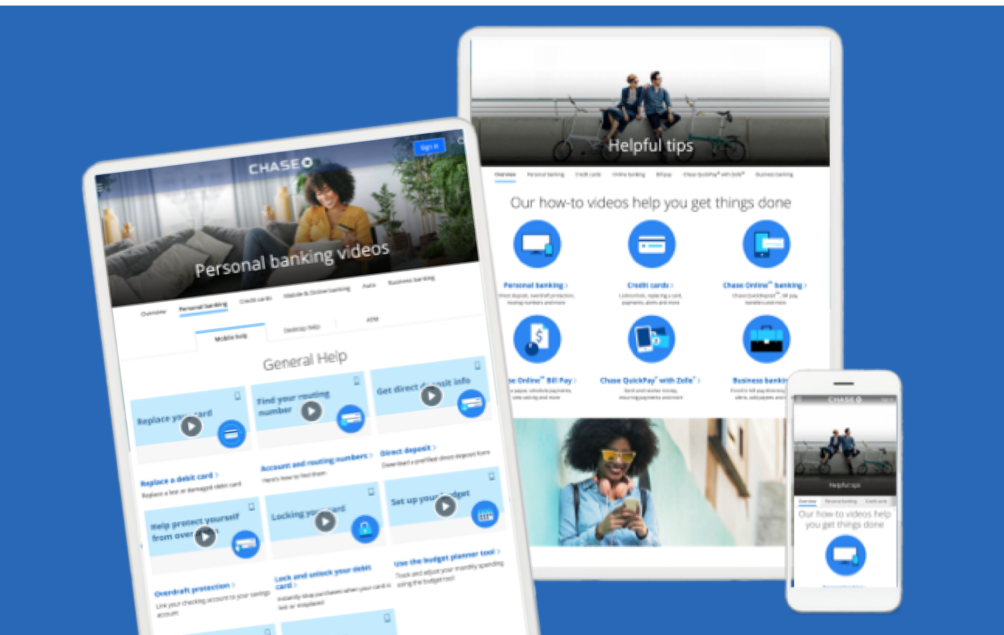
A category-organized gallery (Personal Banking and related topics) replaced a single shallow carousel with a structured, browsable resource.
Chapter 04
Shipping inside Chase’s public pattern library meant solving imagery and layout constraints with precision — especially how hero photos cropped across breakpoints.
Hero imagery had to work across multiple crop sizes without losing the subject or breaking the header treatment.
We documented how the original photo mapped into crop guides and the final primary-image display so production stayed consistent.
Header chrome and tint overlays could easily clip faces or important subject matter if the crop wasn’t chosen carefully.
We paired poor and good examples so the team could spot risky crops before assets went live.
Chapter 05
What changed because this work existed?
The redesigned experience became a high-volume self-service resource, helping customers find guidance for some of their most common banking tasks.
Help Tips averaged more than 40K monthly views from March–August 2020 — roughly 16× the average of the preceding five months.
Usage data revealed clear demand around high-intent banking tasks, with routing numbers, deposits, card replacement, and payments among the most frequently accessed topics.
Avg. monthly views
By organizing support content around customer intent, pairing video with step-by-step guidance, and adapting instructions to mobile, desktop, and ATM contexts, the experience gave customers a clearer path to solving common banking tasks on their own.